
I’m fixing a thumbnail sketch and would like to share some insights on how composition and some grasp of perspective/scale is crucial for a successful painting.
See this sketch below:
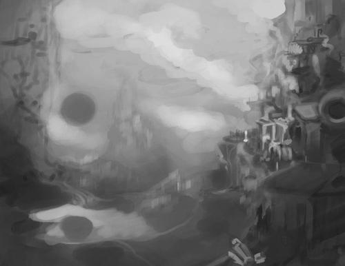
First draft
I LOVE the concept of that black sun, the busy and cramped city, the steam and that huge mountain in the background… There was even a white dragon there at some point.
I still want to tell a story using those elements in a painting, but, so far, this is unlikely. Why?
There are too many elements and they’re all competing for the viewer’s attention. There is no focal point and, as it is, there is a strange empty space in the background (I could fill it with color and draw attention to that mountain/castle in the background, but this would mean another element drawing attention to itself.)
More landscape paintings
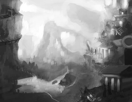
Second draft
I was experimenting with lighting, while having the sensation that I still couldn’t put my finger on what felt wrong in that painting.
Everything still looks cramped… And in a bad way. I also got rid of that interesting, subtler mountain in the background in favor of brighter skies and a bridge structure.
Those three pillars in the foreground are drawing the viewer’s eyes, but there is nothing interesting happening there at all, nor their shape language it redirects the attention received to another interesting place.
The lighting is pretty much random.
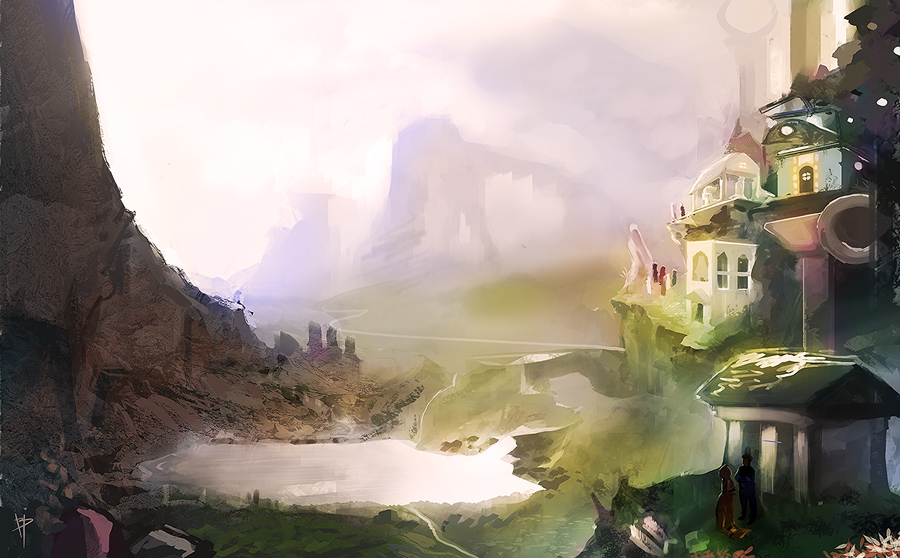
The finished exercise has quite the speedpaint feel to it, despite taking several hours of work! However, I believe it’s easier now to tell the background from the middle and foreground.
There are perspective, texture and lighting mistakes there yet, but see the difference between the lakes, ground and houses in the last painting and the first drafts.
There are also humanoid figures in the lower right temple/gazebo, helping to set a sense of scale.
All things considered, I believe if I had set good structure and perspective from the start, I’d take less time to progress through it and the finished painting would have looked more polished.
Mark Simonetti shows how you can make your own grids in this video, but you can also search for custom grid brushes in DeviantART, for instance.
Lastly, kudos for the wonderful critique received by the folks on Conceptart.org and FB groups. I definitely wouldn’t be able to work on those improvements without them!
Update: This insight is quite a few years old now and I’d like to revise it to add a more informative step-by-step.
In the meantime, though, please use the comments session to ask any questions (those will help me when it’s time to revise this!), and I also recommend my most recent works, tips and insights.
Leave a Reply