
This post shows the developmment of the Redream logo, including studies and sketches. A big thanks for the collaboration, Anthony!
Redream is a Dreamcast emulator currently for PC, MacOS and Linux.
When creating this logo we studied the Dreamcast imagery, from the hardware itself and its physical shapes, to its iconography, and how to bring it into the emulator’s identity.
We explored circular shapes, spirals, the idea of re-play/re-wind and even Sonic.

Development sketches
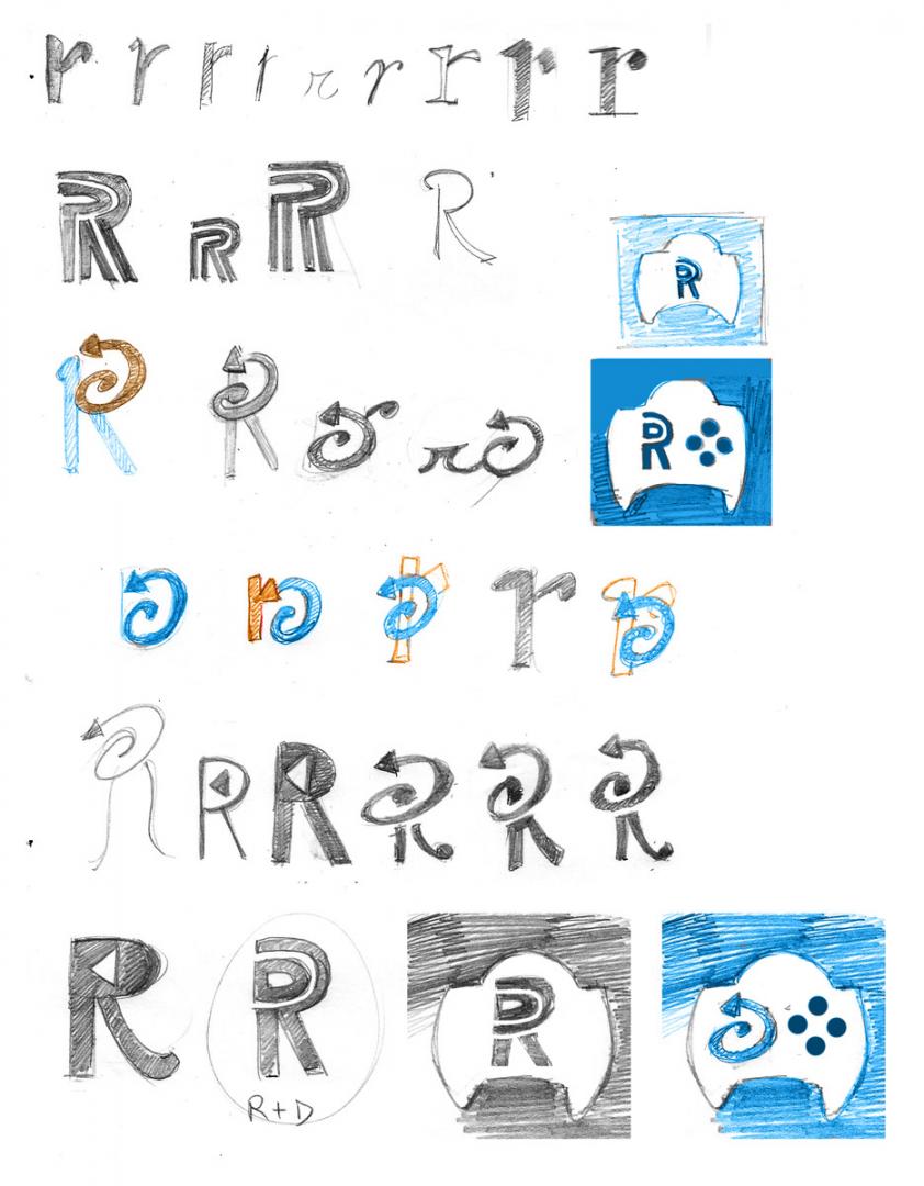
I enjoy making the initial stages of a projet via traditional medium.
I’m sketching the Dreamcast’s controller shape, the idea of “replaying” or “rewinding,” with the logic of using emulators to revisit/replay (so many “R”s!) a game. The Redream name itself plays with this idea as well, so I thought of following a similar path.
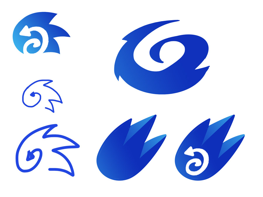
We moved away from using letter designs and started exploring the spirals. Why not blue spirals?
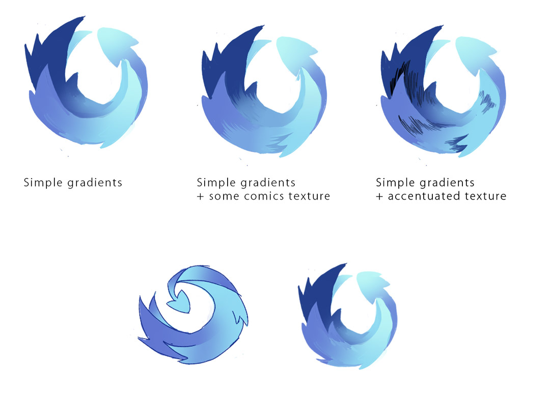
I was drawing inspiration from sprites and animations of Sonic running and thinking about how to express movement via an icon. The version above ended up very similar to Firefox Blue logo!
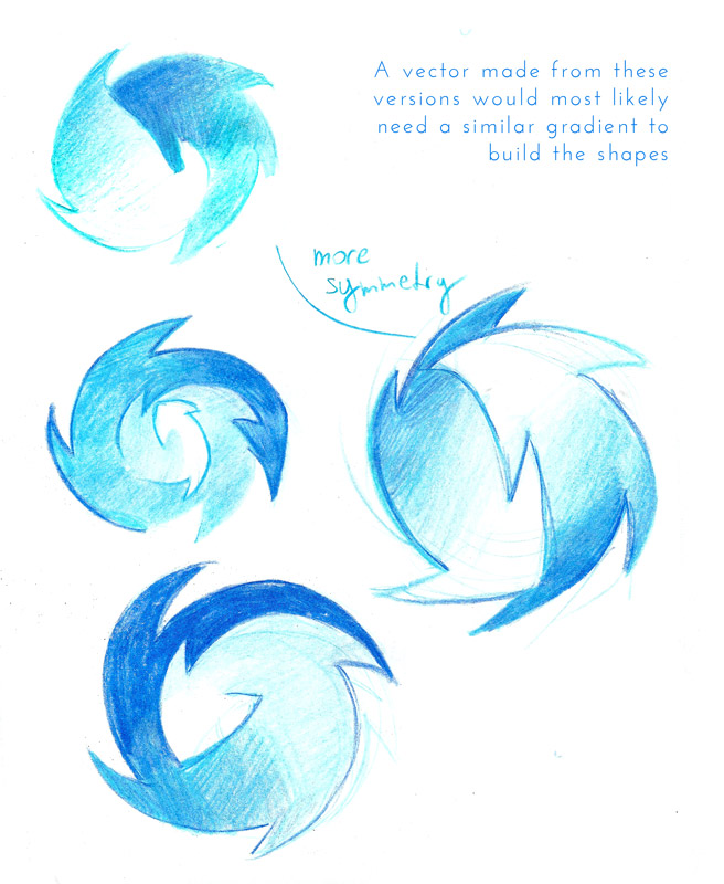
Finally, we reached simpler designs (with less “spikes” and details forming the spiral) and decided to work with gradients to build the Redream logo silhouette.
It’s also supposed to resemble a spinning disk. 💿 ♥ 🔁
We also developed the emulator’s Android controls interface.
This collaboration was a blast overall. Enjoy, and ty!

Leave a Reply