Light and color painting tips
Hi! I’m going to share a few tricks about studying from real landscapes (and photos in general) and capturing their mood rather than getting lost on intricate details.
It really is simple as that — try to mimic what you feel, not the details/technique.
The images used here have this “wallpaper” filter (strong contrasts and saturation) that might distort a few colors. Be aware of that when searching for references.
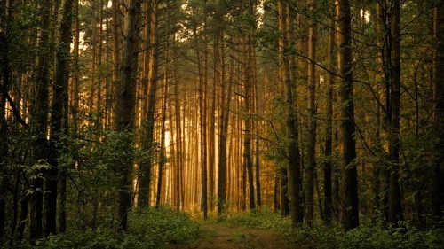
Blur your vision when analyzing your reference
(Not sure if overdoing this is good for your eyes, but) it removes all details and leaves you with a nice composition setup.
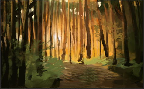
Check the image above “blurred” and notice how it becomes easier to identify the atmospheric perspective, and to trace imaginary lines where the bright orange lights give space to the darker tones in the corners.
It gets easier to position the trees as well! The top of the image isn’t as bright as I though it was, also.
Inspiration: landscape paintings
Beginner and intermediate artists may also be interested in my recent painting tips and insights.
Avoid painting above a black or white background
Try to use at least the sky color as background, or set up gradients with the prevailing color areas before beginning.
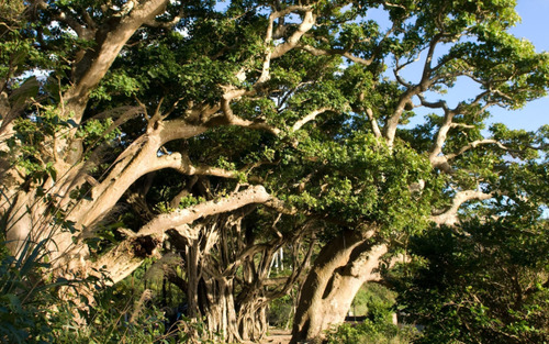
The figure below could have a setup of blue background + large, dark green gradient representing the leaves and a few beige strokes (the branches) as a starting canvas.
Avoid the color picker
Pretend it is like opening the console in a game and typing in some code to get out of an area in which you’re stuck.
I tend to color pick after I’ve established most of the painting, or if I can’t figure a color. Then I reset the color palette and try to figure it again, from memory. My goal is to learn how to consistently figure out and memorize colors with less and less help from the color picker.
I use this color picker rule when copying master studies such as this Peter Paul Rubens’.
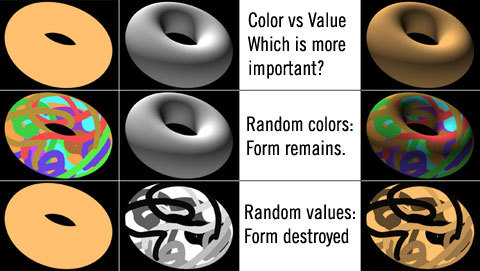
Values are important
Why? Because Colors ≠ values.
Values (aka tone variation, “shadows,” “grayscale”) give form and these alone can make a figure identifiable. As for colors (or hues), they’d look like a mess without any grayscale logic.
I think this image from idrawgirls summarizes it well:
Work big to small
Try to keep 100% of your painting visible on the screen most of the times when in the initial stages.
Why? Because zooming in = details. Establishing good composition and lighting before refining an image is essential.
No need to rely on custom brushes
Photoshop’s chalk brush + removing hardness from any round brush will help setting the initial mood for almost anything. Ko-fi has my free, basic Photoshop brushes.
These painting tips are far from absolutes, but to this day I keep my brushes minimal – I often have huge brush menus, only to use 5-6 of them.
Again, no pure blacks and whites
Try to use at least some colors — even on the darkest shadows!
You’ll notice that the painting becomes less flat and more dynamic. Pure blacks/whites may happen in some kind of environments/landscapes (especially on highly edited images such as wallpapers) but it is not the norm.
- If you feel adventurous enough, render small grayscale thumbnails referenced from real images using pencil and paper!
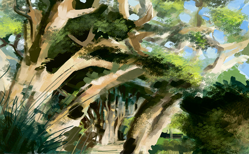
These are my results. DO THE TREES BELOW LOOK LIKE CHEDDAR STRIPS GLITTERING IN THE SUNSET? Yes
I got to keep practicing, but using the methods above has helped me improve quite a lot! Check my painting tips for more guides.
Patreon (hi-res sketches, art insights and more ♥)


Leave a Reply